Three Tests to Improve Your Landing Page
Taking the steps toward improvement can often feel overwhelming. A plethora of detailed tutorials focused on bettering specific aspects of your landing page through testing exist — but what if you’re still stuck on where to begin? Sometimes starting can be the hardest part.
If you need a push in the right direction, we’ve rounded up three simple, high-performing changes that offer easy starting places. In a recent test with Full Cup Creative, a service-based brand saw a 34.5% conversion lift by simply updating these areas of its landing page. Ready to take that first step? Here’s where to begin.
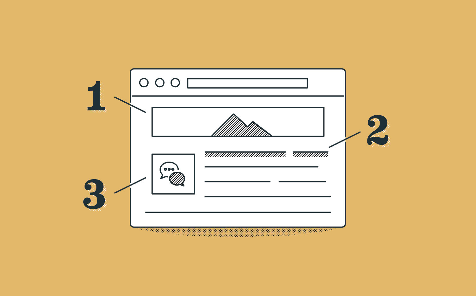
Try New Visuals
When were your images last refreshed? Some brands may benefit from informative or scientific imagery, where many others may see success with lifestyle shots showcasing the human side of your company. While one may seem like the logical fit for your brand, another may actually perform better on your landing page — which is why around here, “creative” is often prefaced with “data-driven.”
Even if you have previously tested an image’s success, new variations across theme and audience may help you discover additional areas of growth. A recent hero image test by Full Cup Creative for a national client reported a 9.21% total landing page CVR lift for branded desktop users after switching to an evergreen graphic. However, the same test showed a 2.82% decrease for branded mobile users. For this brand, the seasonal hero image was the right call for one audience while the evergreen assisted the other. Finding what converts best where is a simple, but beneficial, optimization starting point.
Update Headlines
Product focused versus problem-focused. Informative versus persuasive. Questions versus statements. Your landing page headline has a lot of options, and you won’t know which works best until you test. Consider tying your test headline into an upcoming holiday or time of year — “Ring in the New Year with a better [your product].” or “Save big this spring with special offers on [your service]!” — to keep your page feeling new and fresh. Prefer something less time-specific? Adding “you” statements (“You deserve a better [your product]” instead of “We offer the best [your product]”) into your headlines is an easy place to start.
Updating a headline may be one of the most common tests for landing page optimization — and looking at your results, you may realize even successful tests often don’t end in earth-shattering improvements. In our experience, the largest headline-related lifts are created when expert copy is centered around the customer journey. For example, in a separate Full Cup Creative test, a client with a strong tie to certain times of year saw a 14.87% conversion lift while testing a seasonal headline. However, a different client with no natural business seasonality saw a 1.45% decrease while testing the same concept. Finding the highest-performing headline will look different for each industry and audience.
Make sure to remember the language used to get to this page. If a potential client is clicking on an advertisement, such as paid search or an email blast, keep your language somewhat consistent so it feels connected to what brought them there in the first place.
Expand Your Content
The great copy length debate is never fully settled — some marketing experts claim less is more while others prefer additional copy to overcome sales objections. If you’re looking to optimize your page, consider testing long-form copy through content such as FAQs or additional calls to action. Past Full Cup tests have shown tremendous success with additional content, including an 11.3% lift after adding testimonials to the page for one brand and a 33.63% lift after adding appointment expectations for another. Do your best to read your landing page with fresh eyes and try proactively answering new-client questions through additional copy or graphics.
Ready to take the next step on these tests? Consider running them through AI instead of your traditional A/B testing format. Small changes involving visuals and copy are ideal for AI testing, as you can manage a myriad of variables (including multiple image and text options) in one time-saving swoop.


